Experian-Simmons released some survey data in December that looked at the relative popularity of major television shows for three different political groups: liberal Democrats; conservative Republicans; and middle-of-the-road voters. Each show was given an index based on the concentration of specific voters and this information was used to create lists of the top programs for each political group in both entertainment and news categories.
Although these top ten lists were interesting on their own, the fact that each individual TV program actually had an index rating for all three groups offers an opportunity for more complex analysis. The most obvious next step involves comparing pairs of groups in a 2D scatterplot chart. The Tableau visualization below shows the results.
A few notes:
- Entertainment shows are in blue, news shows are in orange.
- Shows without enough data for a particular group were still plotted as a zero index.
- Hovering over each data point reveals the show and its indices.
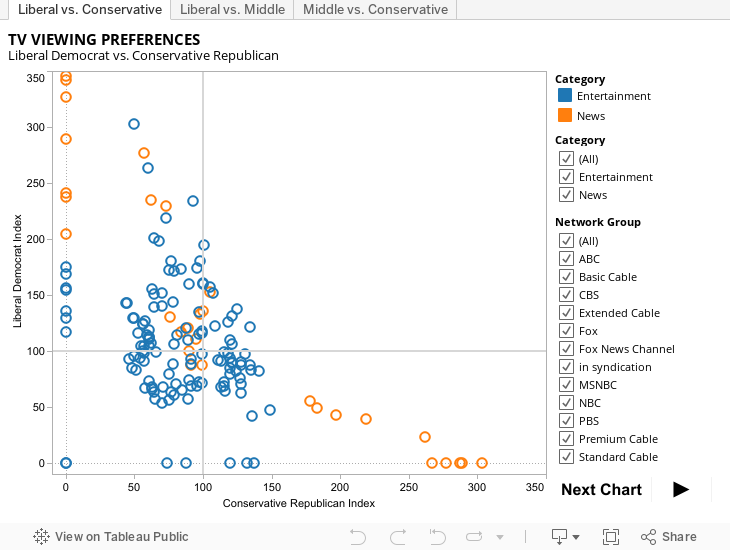
The first thing I noticed was that news shows were much more partisan than entertainment shows. In fact, almost all of the shows with the most extreme scores were either news shows (primarily FOX and MSNBC) or fake news shows (Comedy Central’s Daily Show and Colbert Report). PBS gets a few high scores on the liberal side but the standard television networks are all fairly evenly watched.
Another thing that strikes me is how similar the watching habits of middle-of-the-road voters are to those of conservatives Republicans. The only noticeable exception occurs with news programs, but it is a pretty big exception: FOX News. All of the top ten conservative news programs were all on FOX while none of the top middle-of-the-road news programs were on that network. It might be encouraging for conservative politicians to see the similarities in entertainment interests between conservative voters and independents but I suspect that the gulf in news sources would be hard to overcome.
Many of the other differences have been noted elsewhere but are worth repeating: liberal Democrats tend to favor funnier shows and stories involving morally complex characters while conservative Republicans favor shows where people are doing stuff — either real work or reality competitions.
Of course, having complained about the lack of 2D analysis for this data in the major online outlets, I would be remiss if I didn’t point out the fact that each show has three indices apiece. Logically, we should be trying to show the data in a 3D scatterplot.
This isn’t as easy as it sounds since most of the major charting applications aren’t very good in 3D and they don’t provide any interactive option for the web that I could find. The best options seemed to be R or something called CanvasXpress — neither of which I had worked with before. I chose R, which allowed me to create both static and interactive 3D plots. However, only screenshots of the interactive plot are available at the moment. Several hours later …


This is interesting. I don’t suppose it would be possible to add some more divisions? It would be interesting to see Entertainment split into common genres (Sci-Fi, Fantasy, Sitcom, Drama, etc), and the addition of Education and Religious programming.
Hm. It might take some manual categorization of the data…
— Abbey