
A roundup of random thoughts on data, information and design for the New Year.
Diversity in the 116th U.S. Congress
There has been a lot of discussion this week about the racial, ethnic and gender makeup of the incoming class of congress, including celebrations of firsts on the Democratic side of the aisle to laments that the incoming Republican representatives looked like a corporate board from the 1950s.
The starkness of some of the pictures made me wonder if there was a way to summarize the differences between the two political parties. Using a technique from a previous post, I was able to average the images of 67 incoming freshmen Democrats and 44 incoming freshmen Republicans into a side-by-side comparison. Yeah, it’s pretty obvious …
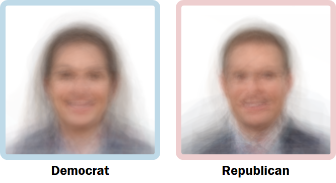
Time to change your approach, boys!
A Sample of Survey Spelling Errors
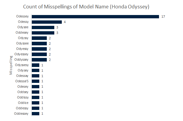
I’ve already written a post about the impact that spelling errors can have on your data but a recent review of an old research project made me want to revisit the topic. This particular project involved a survey of vehicle owners and the use of a text input box for questions about the “make” and “model” of a vehicle.
There is nothing necessarily wrong with free-form comments or open-ended questions but if you use such an approach for categorical questions — the groupings you’ll be using to summarize the results of your survey — you’re asking for trouble. For this survey, there were two big issues: 1) not all respondents knew what the terms “make” and “model” meant (e.g. Toyota Celica or Ford Mustang); and 2) people cannot spell worth a darn.
For issue #1, less than half the people surveyed answered the make and model questions appropriately. Transposition of the responses and the addition of extraneous information like model year, trim or body style severely reduced the correct response rate and required a large amount of manual intervention to correct. Issue #2 caused even more headaches. The winner for most misspelled vehicle model was the Honda Odyssey minivan:
The better approach in these circumstances is to limit the respondents options with a drop-down menu or other user interface elements.
Echoes of the Great Migration
The New York Times published an interactive map of Facebook connections back in September. It was very interesting to see some of the southern “hot spots” of friends associated with northern cities like Milwaukee and Chicago.
Many of these connections are the direct result of the migration of African-Americans in the early 20th Century. Of the three main routes out of the South, the roads and rail lines along the Mississippi River were used primarily by migrants from Alabama, Arkansas, Mississippi and Tennessee looking for work in the industrial centers in the Midwest. The family histories of people like Oprah Winfrey, Michelle Obama, and many others can be traced to this massive population shift.
Here are details showing the “likelihood of friendship” for Milwaukee County (Milwaukee) and Cook County (Chicago) … along with neighboring suburban counties such as Waukesha County (Milwaukee) and DuPage County (Chicago).
![]()
The African-American populations in the urban centers of these cities still have large pockets of friends and family in the South. Suburban counties to the west have lower numbers of African-Americans and limited connection to the area. (I personally think the Chicago-Milwaukee corridor is ripe for some Mississippi cousine!)